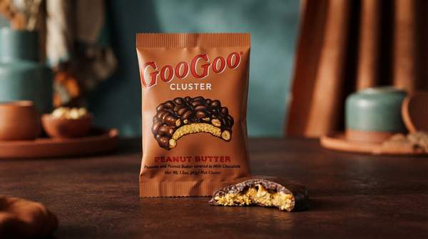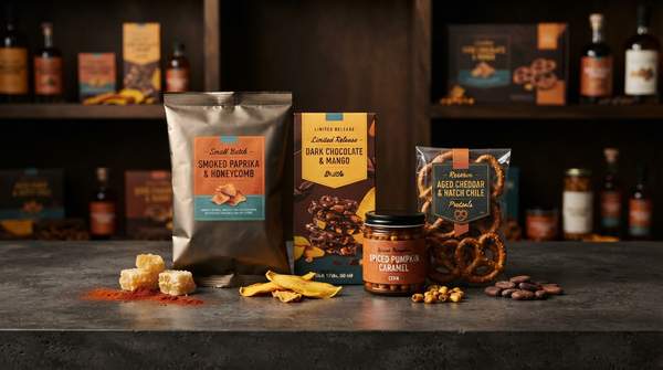
Before you taste a single chip, your brain has already made a judgment about it. That judgment comes from the bag: its color, its shape, its finish, even the way it feels in your hand. Snack packaging is not a neutral container; it is a carefully constructed communication device, and consumer psychology research shows its cues trigger predictable associations about taste, healthiness, and quality. Understanding this "language" is the difference between choosing a snack and being chosen by one.
Decoding Snack Packaging: The Psychology Behind Your Choices
Packaging and consumer behavior are deeply intertwined, as industry analyses of retail design consistently note. Different colors and shapes in packaging affect people's perception of a product's quality, and color in particular carries strong emotional associations—which is why brands choose their hues strategically and use them consistently so shoppers can spot products quickly on a crowded shelf. A packaging-industry guide from Creative Displays Now frames the relationship plainly: design elements collectively shape both perception and purchasing decisions. The stakes are commercial, too. OXO Packaging, a packaging supplier, reports that around 52% of customers are likely to repurchase products presented in good-quality packaging. In other words, the wrapper is doing sales work long before the food does flavor work.
The Visual Language of Color and Shape
The most-studied visual cues are also the simplest. A scientific review of visual design cues and food choice, published in the journal Foods, documents how shape alone shifts expectations: the association between product or package roundness and sweetness could explain why round packages are liked more, and curved shapes are further linked to vanilla aroma while angular shapes are associated with citrus. So a rounded, soft-edged snack package nudges you toward expecting something sweet, while sharp angles prime sour or citrus expectations.
Color works similarly. Research cited in that same review includes a study by Schuldt on whether "green means healthy," examining how nutrition label color affects perceptions of healthfulness. The Ghent University marketing team of Laura De Kerpel, Barbara Kobuszewski Volles, and Anneleen Van Kerckhove, writing in the journal Foods, note the broader pattern: watered-down or "lighter" colored packages signal that the product inside is healthier, while more vibrant colors make the packaged product seem more attractive. These are general associations, and they vary among consumers—but they are consistent enough that brands exploit them deliberately.